Quiet Luxury, Built from Nature’s Touch

Today we’re exploring layering natural textures and neutrals for timeless sophistication, pairing linen, wool, stone, wood, and soft mineral hues to create rooms that breathe. Expect practical guidance, sensory details, and small stories that prove restraint can feel generous. We will balance warm sand and cool stone, celebrate patina, and dial contrast with intention. Share your questions, favorite pairings, and photos; let’s craft calm, character, and longevity together, one honest material at a time.

Mapping the Neutral Spectrum

Neutrals become compelling when undertones converse: a whisper of mushroom in taupe, a hint of olive in greige, the chalky light of plaster beside soft charcoal. We’ll map values, warmth, and reflectance so textures read clearly in daylight and evening glow. Expect actionable palettes, test methods, and reassuring guardrails that keep minimalism expressive rather than flat.

Textiles That Invite the Hand

Nothing persuades like touch. Layer washed linen, tightly woven cotton, open-weave gauze, wool bouclé, and a grounding jute rug so the eye perceives depth before the hand confirms it. We’ll discuss drape, pile height, and edge finishes that make restraint feel deeply inviting, even in hardworking family spaces.

Wood, Stone, and Clay That Earn a Patina

Nature’s surfaces bring quiet gravitas. Pale oak, smoked walnut, travertine, limestone, and hand-formed clay carry grain and pores that tell gentle stories. We’ll consider finish choices, joinery, and thicknesses that look substantial without heaviness, allowing patina to accumulate like a diary of unhurried, beautiful days.

Oak Grain, Walnut Shadow

Pair quarter-sawn oak cabinetry with a low-sheen hardwax oil, then temper with a single walnut piece for shadowy depth. The dialogue of grains prevents monotony. Keep profiles simple; let figure, rift lines, and occasional knots supply the room’s gentle ornamentation.

Travertine, Limestone, and Quiet Veining

Choose honed stones with filled pores where needed, leaving select surfaces open for tactile honesty. Veining should read like watercolor, not roadmaps. A thin shadow reveal under tabletops tricks the eye, creating lightness while preserving the satisfying presence of solid mineral slabs.

Clay, Terracotta, and Limewashed Walls

Handmade clay tiles and limewash render deepen atmosphere through unevenness that catches light. Embrace brushstrokes and tonal clouds; they feel human, not imperfect. Seal appropriately in kitchens, and let breathable finishes regulate humidity, protecting wood joinery and lending rooms a calm, monastic hush.

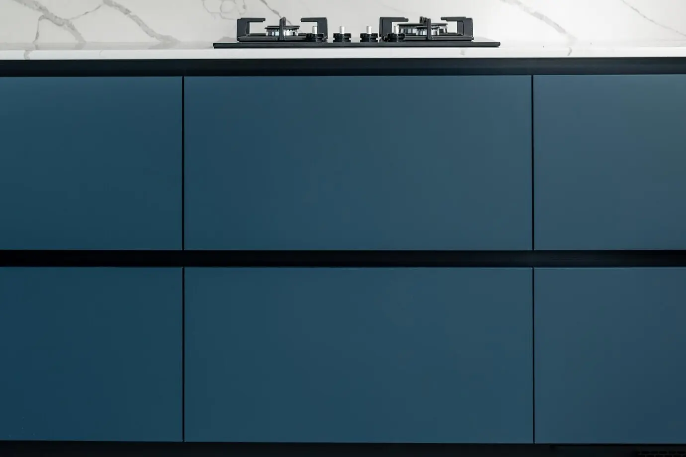
Light, Shadow, and Gentle Contrast

Light animates texture. We’ll calibrate brightness, contrast, and reflection so every surface participates without glare. Layer dimmable lamps, linen shades, and discreet picture lights, then invite shadow to model form. A touch of sheen beside expansive matte makes neutrals sparkle quietly, like frost across stone at dawn.

01

Matte vs. Sheen: A Conversational Duo

Set waxed plaster near brushed brass so light glides, not bounces. Combine chalk-matte walls with low-lustre timber to avoid deadness. Use lacquer sparingly on small accessories, creating tiny highlights that guide the eye along surfaces without breaking the overall hush of restraint.

02

Layered Window Treatments for Lived-In Glow

Sheer linen filters mid-day glare; a heavier wool or lined flax draws at night, deepening color gently. Hang near the ceiling and kiss the floor for elegance. Tie back casually to reveal casement hardware, letting metal punctuate the softness like punctuation in poetry.

03

Metal Accents: A Pinch, Never a Pour

Blackened steel, aged brass, and pewter mark edges and offer temperature contrast. Use slender profiles on tables and frames so metal supports, not dominates. The result is a measured glimmer that clarifies silhouettes and keeps natural fibers looking even more tactile by comparison.

Composing Rooms with Scale and Rhythm

A room reads like music when scale and spacing create rhythm. We’ll temper large, grounding pieces with smaller, textured notes, keeping sightlines clear. Group objects in odd numbers, vary heights, and leave generous pauses. This choreography reveals material nuance and lets neutral tones hum confidently.

Care, Longevity, and Sustainable Choices

Beauty that lasts respects origin and upkeep. We’ll choose responsibly sourced timber, recycled wool, and low-VOC finishes, then outline simple care rituals that preserve texture. Expect shopping checklists, repair tips, and budget-friendly swaps that build integrity over time, aligning daily life with calm, enduring elegance.

Maintenance That Respects Material Truth

Treat wood with breathable oils, brush rugs with a natural-fiber beater, and launder linens cool to protect slubs. Accept small dents and sun shifts as character, not damage. Keep a notebook of finishes and dates, making care feel purposeful, almost ceremonial.

Buying Fewer, Better Pieces

Invest in honest construction: mortise-and-tenon joinery, solid wood edges, reversible cushions, repairable lamp sockets. Share local makers you love in the comments so others discover them. Consider vintage as a shortcut to patina, trimming landfill while adding narrative depth to quiet rooms.

Femikehutatuzaxavilonuma
Privacy Overview

This website uses cookies so that we can provide you with the best user experience possible. Cookie information is stored in your browser and performs functions such as recognising you when you return to our website and helping our team to understand which sections of the website you find most interesting and useful.